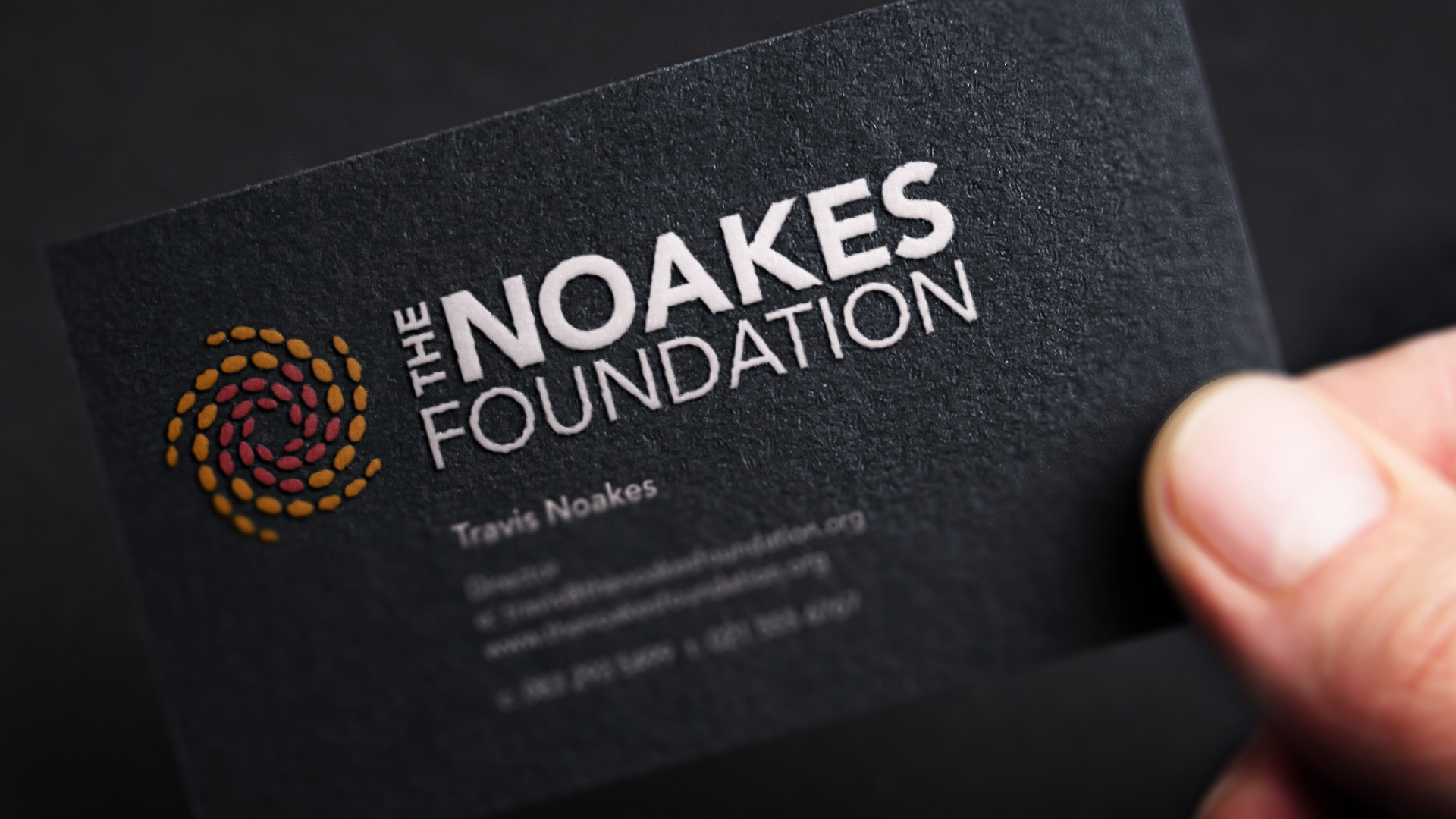
Noakes Foundation brand identity brief
Jonathan Whelan Creative Consulting was commissioned to design and refresh The Noakes Foundation brand identity. a Public Benefit Organisation in South Africa.
The aim of the project was to refresh the visual identity of the organisation responsible for advancing medical science’s understanding of the benefits of a low-carb high-fat (LCHF) diet by providing evidence-based information on optimum nutrition. Founded by Professor Tim Noakes, the foundation’s research is free from a commercial agenda.
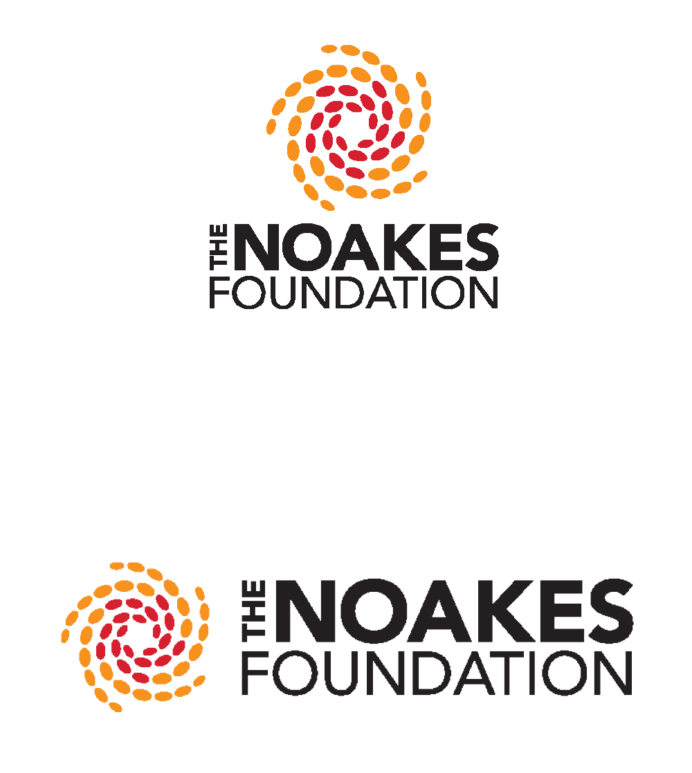
The spiral metaphor
The primary concept for the Noakes Foundation brand identity redesign was to introduce the ‘spiral’ motif. This logo icon depicts seeds flowing in a circular motion. The seeds appear to be spreading from the centre outwards, but at the same time they also seem to gravitate towards themselves. This demonstrates the funding procedure and exchange of knowledge in The Noakes Foundation.
The spiral is shown to be moving left to right giving us a feeling of momentum. The ‘sun’ shape that is created by the motif depicts prosperity and positive change


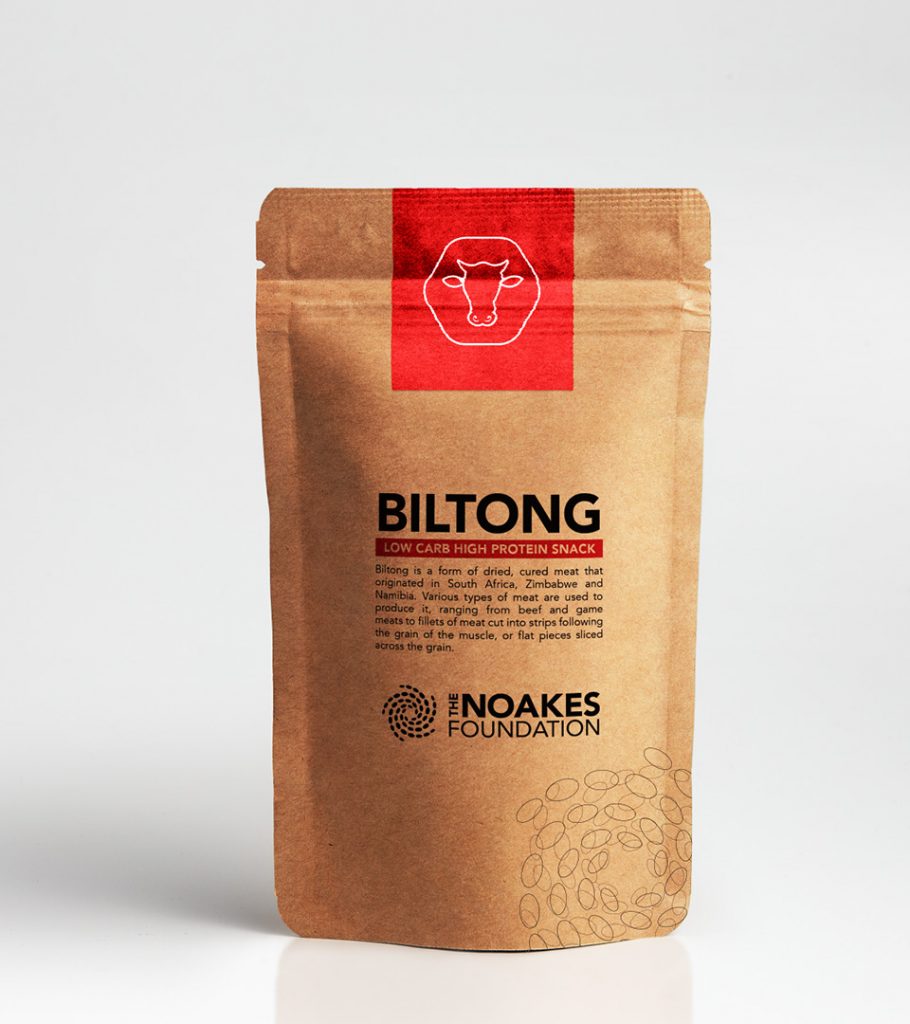

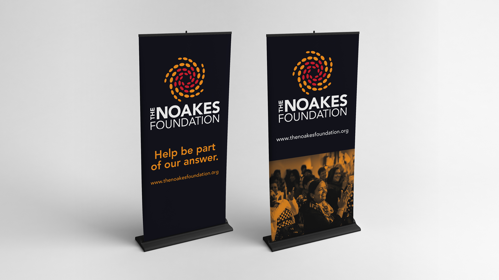


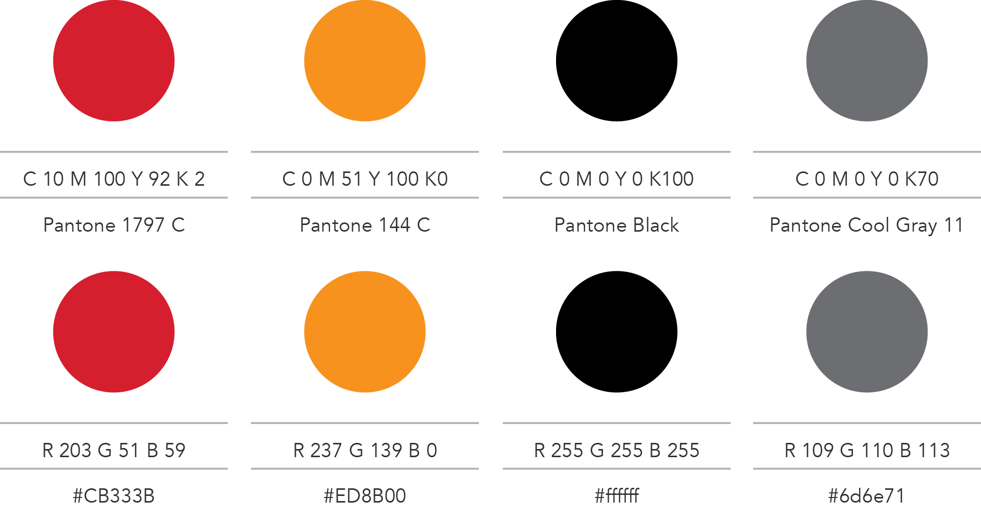
Primary colour palette
These warm colours were inspired by the the Southern African landscape and natural surroundings. They have close relationships to fire, passion, earth, celestial beauty and the universe.
Typography