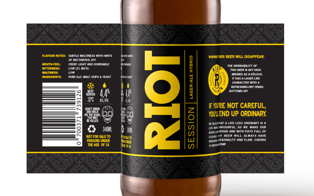
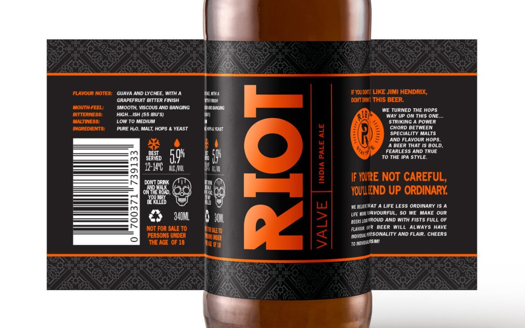
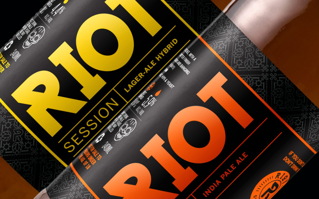
The brief
Refresh Riot’s craft beer label design to create stronger shelf presence in a competitive craft beer market. The new direction should feel bold, distinctive, and unmistakably “rock ’n roll,” while introducing a layer of sophistication that elevates the brand without losing its edge.
The outcome
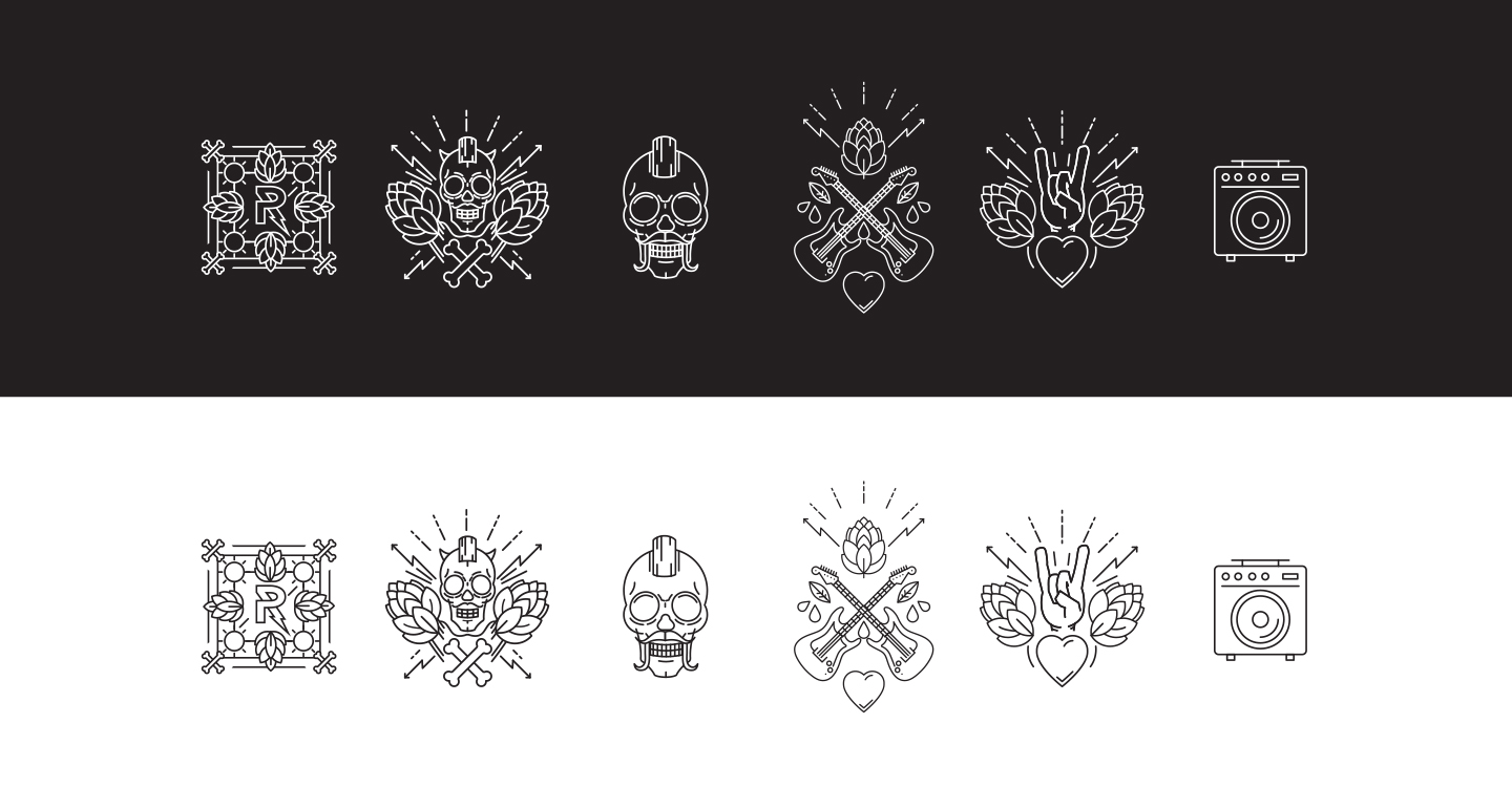
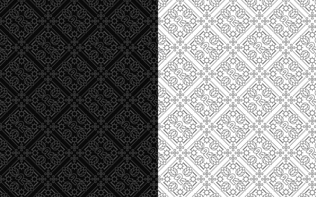
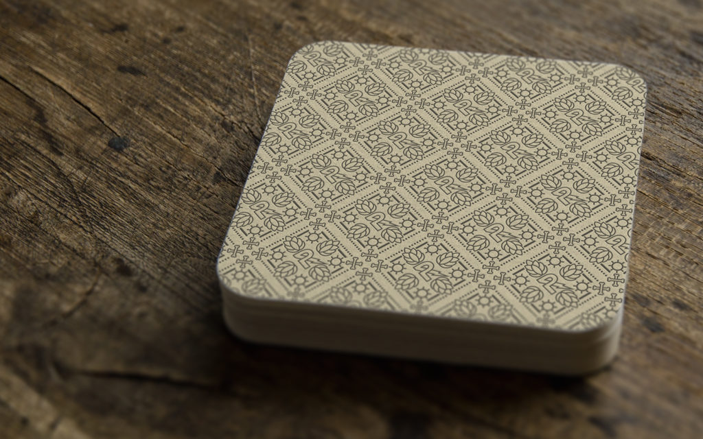
Guided by the idea to “be bold and loud with a twist,” the new label design balances high-impact visuals with a more considered, sophisticated finish. Intricate patterns and subtle illustrations were introduced to embed layers of storytelling, referencing the brand’s heritage while rewarding closer inspection.
At the same time, the overall aesthetic was refined to feel clean, contemporary, and confident — ensuring the labels not only command attention on the shelf but also elevate Riot Beer’s distinctive rock ’n roll identity.
Before & After